

Compliance work has one structural problem: it stays invisible until it is late. A cleaning you skipped is obvious the moment you open the door; a broken boiler gets reported by the guest within five minutes. A parte de viajeros (the traveller report Spanish hosts must file) that never got submitted announces nothing at all: it just sits there, quietly turning into a problem with the authorities.
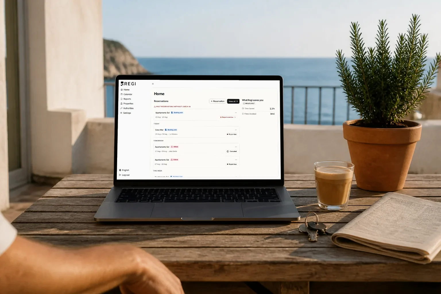
So we rebuilt the Regi dashboard around a single question: is anything urgent right now? Not a grid of charts you have to interpret. The first thing you see is whether you have overdue or pending partes, and if you have none, we say so in plain words.
The problem: what you cannot see, you do not do
When you run holiday rentals, your day organises itself around whatever shouts loudest, and regulatory compliance never shouts. Traveller registration under RD 933/2021 (Spain’s Royal Decree on guest data reporting) requires every guest’s details to be filed with SES.Hospedajes, the national reporting platform, and that task produces no signal when you miss it: no annoyed guest, no phone notification, nothing.
The usual outcome is familiar: you remember the pending parte the day an official letter arrives, and by then it is no longer a two minute task but the risk of a fine of up to €30,000. A dashboard full of occupancy metrics can hold all the information in the world and still fail to answer that one question.
Inicio: the screen that answers before you ask
Regi’s landing screen used to be called “Resumen”, a summary. It is now Inicio, and the rename is meant seriously: it is not a data digest, it is the starting point of your day.
Overdue and pending, at the very top
The first thing on the screen is your pending and overdue partes. Nothing to search for, nothing to filter: they hold the prime position because they are the only items that can cost you money if ignored.
Overdue items get their own named group, “vencidos”: not mixed in with everything else, and not distinguished by colour alone. That distinction matters, because “pending” and “overdue” ask different things of you. Pending gets scheduled; overdue gets solved today.
”All clear” is an answer too
The detail we like most in the redesign is the empty state. When nothing is urgent, the dashboard tells you so explicitly: all clear. It does not go blank, and it does not leave you staring at an empty list wondering whether there is genuinely nothing or the page simply failed to load.
That sounds minor and is not: half the value of an alerting system lies in being able to trust its silence.
Small things you notice every single day
- Dismiss an alert, and undo it. If today is not the day, push it aside without losing it for good, and pull it back if you change your mind.
- Dates with the month spelled out. No more working out whether 07/08 means July or August.
- Status text at AA contrast. Statuses stay readable in midday sun, on a phone screen that is already two years old.
Upcoming reservations: the dashboard’s main list
Below the urgent block, the dashboard’s main list is your upcoming reservations: first what is running late, then what is coming. The list is fed by calendar sync: you connect the iCal feeds from Airbnb, Booking, Vrbo, Holidu or any other valid feed, and bookings arrive on their own. From there the path continues into the guest’s online check-in, where the traveller fills in their own details and signs from their own phone.
The savings ledger, right beside the reservations
Next to the reservations sits a sibling panel: the savings ledger. The idea is fairly unusual for this kind of tool: as well as the work still waiting, show the work you are no longer doing. Above, what is outstanding; beside it, the running tally of what got handled on its own.
When your subscription blocks something, the screen says so
A classic of management software: you open a section, something does not work, and the message is a generic error. Now, when your subscription status blocks a screen, that screen names exactly what is happening and where to go. It is still a block, but it stops being a mystery.
On mobile: a bottom bar instead of a side menu
Running rentals happens standing up, one handed, between two properties. Regi’s mobile navigation was rebuilt from scratch:
- Bottom navigation bar. The main sections live where your thumb already is, not behind a hamburger icon in the top corner.
- The “Menu” tab expands the bar itself, opening upward in the same place you were already looking.
- The mobile sidebar is gone. The old sliding sheet was a desktop pattern wearing a mobile costume.
- Filter rails are now a scrollable chip row: you see at a glance which filter is active and switch with a horizontal swipe.
Regi installs like an app (no app store involved)
Regi is an installable PWA: add it to your phone’s home screen and open it like any other application, full screen, with no browser chrome. We also built dedicated launch screens for each iOS device, which is the difference between an app that feels like an app and a shortcut that feels like a bookmark. Nothing to download from the App Store or Google Play, no updates to approve. The icon is on your home screen, and that is it.
A calmer visual system
All of this sits on a warm monochrome visual system with self-hosted Inter as its typeface: the font is served from Regi itself rather than a third party, so it loads sooner and does not leak your visit to another server. And the monochrome is not an aesthetic whim: when the interface saves colour for what genuinely demands attention, an overdue parte stands out without having to blink.
Being clear about what this is (and what it is not)
This is a redesign of how the work is surfaced, not a change in what Regi files on your behalf. The parte de viajeros is still submitted to SES.Hospedajes exactly as before, with the same legal scope, and amending or cancelling a parte works as it did. What changed is that the app tells you what is missing before you go looking for it. The legal substance (what a parte is, what RD 933/2021 requires, what happens if you do not file) is covered in the traveller registration app guide.
Frequently asked questions
How do I install Regi on my phone? On iPhone, open regi.es in Safari, tap the share button and choose “Add to Home Screen”. On Android, open Regi in Chrome and use the install app option in the browser menu. No app store required.
What counts as an overdue parte? A traveller report that should already have been filed and has not been. Regi groups those cases in the “vencidos” (overdue) section, kept separate from the merely pending ones. The specific deadlines are set by regulation, so check them through official channels.
Can I dismiss an alert without losing it? Yes. You can dismiss an alert to clear it out of the way and undo that action afterwards if you acted too quickly.
Does this redesign change what Regi sends to SES.Hospedajes? No. It changes how outstanding work is presented to you, not the filing itself. Traveller report submission under RD 933/2021 is unchanged.
Do I need to download anything from the App Store or Google Play? No. Regi runs as an installable web app, so you add it to your home screen straight from the browser.