

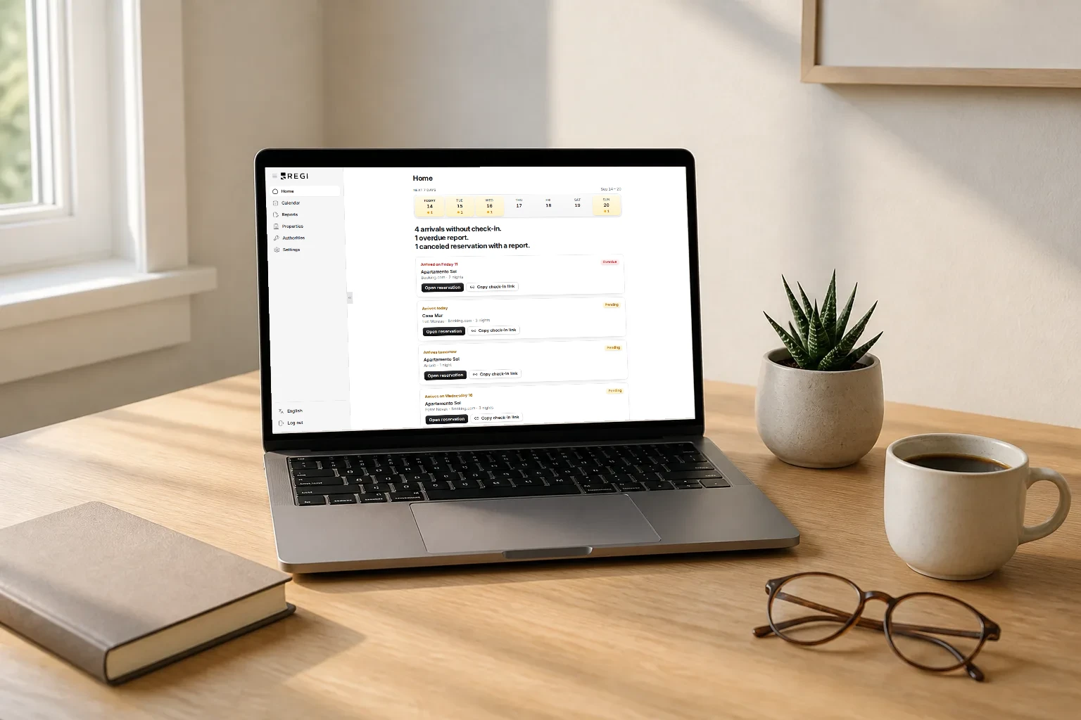
The week of September 7 to 11 we didn’t add a feature: we rebuilt the manager app’s interface. Before, every corner carried its own small decisions, and you felt it each time you moved from one screen to another; now everything looks like everything else. On top of that, four places changed for real: the sidebar, Home, each lodging’s page and the reservations list. Here’s each of them, and at the end what has not changed, including what you still can’t do.
One way of doing things
What you get out of this doesn’t show up in a single screenshot; it shows up after using the app for a while: there’s nothing to re-learn when you move between screens. The save button looks the same on a lodging’s page and in Settings. A text field behaves the same when you add a property as it does in a filter. Tabs are the same tabs everywhere.
There’s one rule behind it that you can check for yourself: anything that stands out from the page is either something you can press or something waiting on you. Anything already settled stays flat. That’s why a reservation row whose report is already filed carries no lift, and a card for an overdue check-in does. When something stands out on screen, it stands out for a reason.
Dark mode still can’t be turned on
Plainly: dark mode is ready, but there is no switch in the app that turns it on, and it doesn’t come on by itself if your computer is set to dark. It still needs a screen-by-screen review before we offer it, and until that review is done we’d rather not ship a half-checked version. No date yet.
The sidebar collapses, and mobile follows
On desktop, the sidebar collapses to a narrow column of icons with labels on hover, and expands to full width when you need it. Regi remembers how you left it: collapse it to gain room and it’s still collapsed next time you sign in. Ctrl/Cmd+B opens and closes it from anywhere in the app, and the shortcut steps aside inside a text field, where that combination means bold.
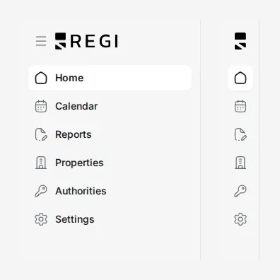
On a phone there’s no sidebar: there’s a fixed bottom bar with Home, Calendar, Reports, Properties and a Menu button for the rest. What changes from the previous dashboard is that the two navigations stopped being two separate things: they’re one, with the same items in the same order, and the section you’re in is marked the same way in both. Your phone and your laptop can no longer disagree about where you are.

Home is now your week
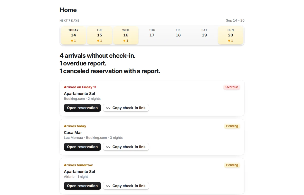
The home dashboard already put overdue and pending reports at the top. What this redesign adds is that Home is no longer a list of upcoming reservations: it’s a summary of the next seven days, today included.
At the top there’s a seven-day strip saying, day by day, how many arrivals it holds and how many of them are still without a check-in. Below it, a verdict in one short sentence, before anything else: “4 arrivals without check-in. 1 overdue report. 1 canceled reservation with a report.” And under the verdict, cards for whatever needs resolving, each with when the guest arrives, which lodging it is, and at most two actions: open the reservation or send the guest their check-in link.
It’s the same idea that already runs through the automatic email alerts that land on Mondays: if the email can sum up your week in one sentence, the screen should too, the moment you open it. And when nothing is pending we don’t leave you with a blank screen to guess whether there’s no work or it simply hasn’t loaded: a “Check-ins complete” seal says so.
A lodging’s page edits where it lives
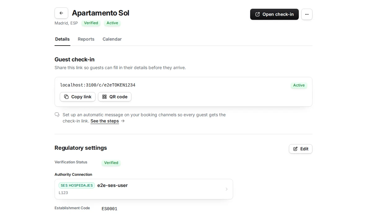
Before, changing one detail of a lodging opened the same multi-step wizard used to create it: walking through screens you didn’t want to touch just to fix an address. Not anymore. The page now carries the name at the top, two status labels (verification, and whether it’s active), a button to open the check-in link and a menu for the rest; below that, three tabs: Details, Reports and Calendar.
Inside Details, each section edits in place. You press “Edit” on the one you care about, the values turn into prefilled fields, and “Save” only lights up once you actually change something. Escape cancels. On a successful save a quiet “Saved” appears and that’s it — no window to dismiss. If something fails, the fields stay exactly as you left them with one line explaining what happened: you don’t lose what you typed. The multi-step wizard still exists, but only to add a new lodging.
One limit you’ll run into: while SES is checking the establishment code, that section can’t be edited. The “Edit” button shows as disabled with the reason next to it (“The code and authority connection cannot be changed while SES checks them”), instead of letting you save a change that was going to be rejected.
Reservations: a list that runs by month
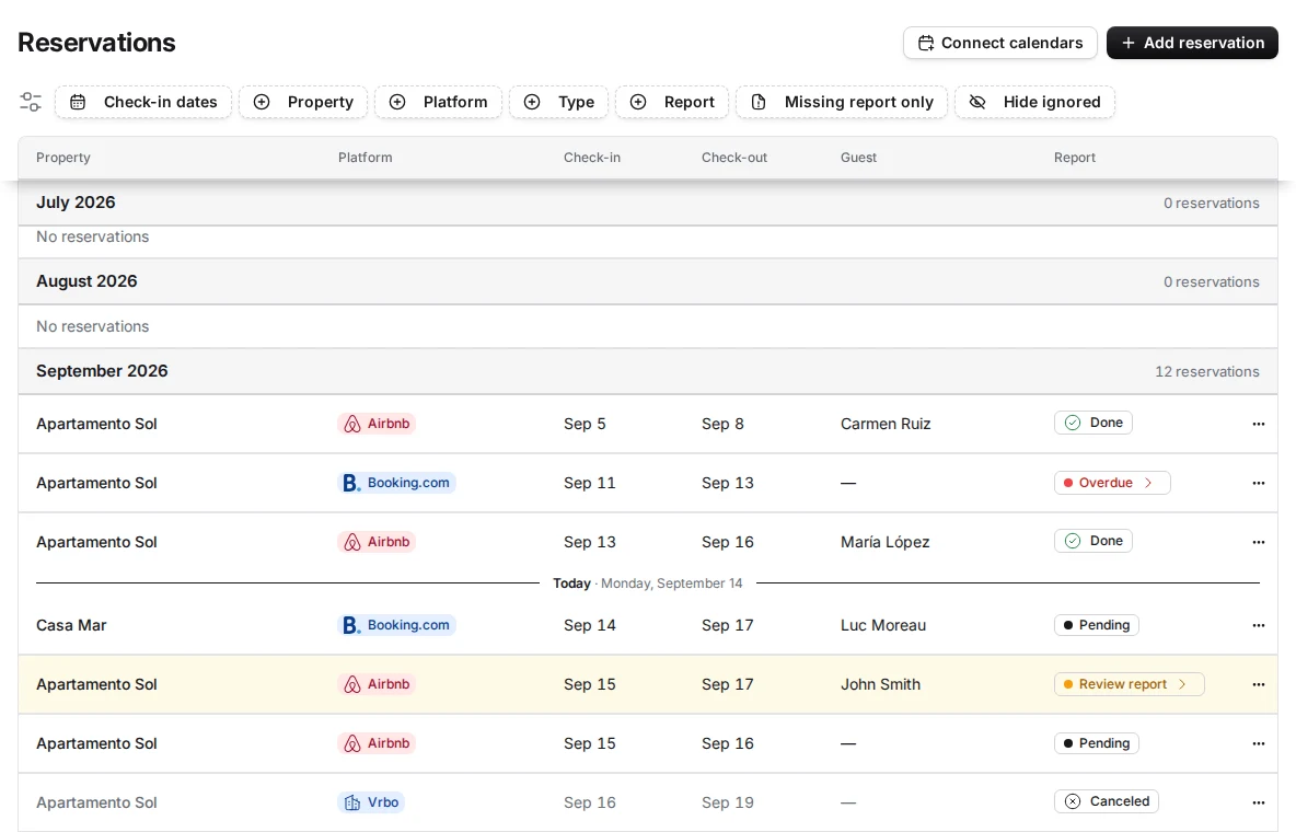
The reservations list used to be a timeline. It’s now a list grouped by month that scrolls in both directions, and it always opens anchored on today: you don’t have to hunt for where you are.
It’s worth being precise, because “calendar” promises something else: it isn’t a day grid like a wall calendar. It’s a list, ordered by check-in date and split into months, with a “Today” row marking the point past which everything left is an arrival still to come. Scroll up or down and months load one at a time, not all at once.
That scrolling has a stop: twelve months back and twelve forward from the current month. When you reach the end, a line tells you to use the date filter to see reservations before (or after) that, which does reach further. And there’s one deliberate exception: a pending obligation never slips off the top. If you have an unfiled report from months ago, it’s grouped at the start of the list even when its month falls outside what’s loaded.
The reservations themselves are the same ones as always, the ones arriving through the calendar sync over iCal. What changed is how you see them.
What doesn’t change
A redesign this size invites assuming more happened than actually did, so:
- Dark mode can’t be turned on yet. It’s ready; the screen-by-screen review and the switch are what’s missing. No date.
- Month scrolling reaches twelve months in each direction. Further back or further ahead is reached with the date filter, not by scrolling.
- What gets reported to SES.Hospedajes doesn’t change. This is a redesign of how information is presented and edited, not of the content or the deadline of the traveler report.
- Your reservations and your reports are the same. Not one piece of data moved: only the way it’s shown to you.